We at Initlab develop, support and improve Drupal websites. Today we'll tell you how we've completely redesigned and re-structured www.mbureau.energy.
A small remark: the design was developed by our good friends from Planchet studio based on the results of our SEO-design. We detailed all the necessary recommendations and implemented the finished design on the website.
The challenge. We were approached for a standard redesign, to update the background, colours and forms. We carried out a site audit and suggested a more productive approach: together with the design update, carry out SEO work, work on the structure of the sections and pages of the site.
Specifics of the client's business. The project is dedicated to modelling in the wholesale electricity market. There are no such narrowly themed blogs on the Russian language network.
We prepared a lengthy SEO design document in which we detailed our vision, suggestions and wishes for the project. After the agreement with the client, we proceeded with the redesign. In this case study we will omit most of the technical details and show the main visual and structural solutions.
Positioning
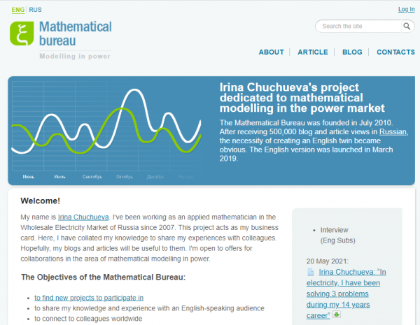
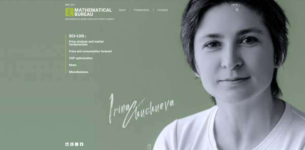
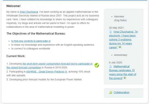
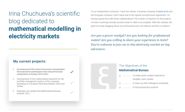
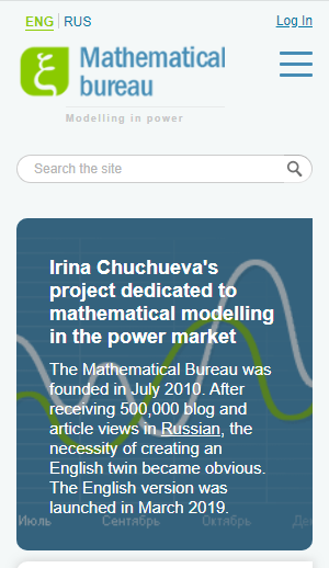
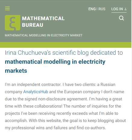
First of all, we suggested strengthening the positioning. In the past, the main page would tell the user about the maths bureau, i.e. in the majority's view of some kind of organisation. The headline stated that it was a project of Irina Chuchueva. The information was presented through an abundance of text and did not make it clear what was more important: the identity of the creator or the activities of the organisation.
We solved this problem this way:
- now the first thing the user sees is the founder's picture. So we have shifted the focus to the fact that for the most part this is her blog, her project and most of the articles are written by her;
- the creator's competencies are expressed through portfolios and academic articles, so we have displayed them more prominently on the main screen;
- in this way we have harmonised through the visual the personality of the creator and her brainchild.
Technical and visual solutions
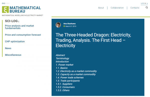
We kept the light tones, the minimalism. The previous site had a really smart colour scheme for the specific content. We left the design minimalistic and light, perfect for the perception of charts, tables and formulas.
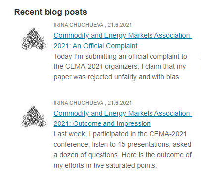
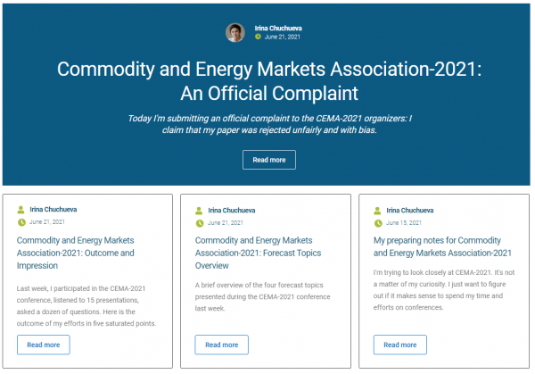
We've separated important elements with blocks and brought their design to life a little. For example, article teasers used to be solid text with a hyperlink in the title. Now they are more bulky interface elements with "Read more" buttons.
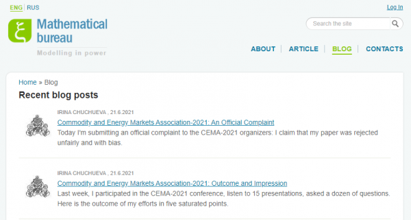
The menu has been shortened. In the old version "Articles" and "BloIt wasn't entirely clear to the reader what the difference was. g" were separate menu items. One might have assumed that the blog contained the creator's articles and the articles contained more suggested material, but both contained mixed entries from different authors. We suggested merging this section into "Blog" and putting it in the bottom menu, on the home screen and as article teasers on the home page + putting the "Collaboration" block separately in the menu. Previously, it was part of the welcome text.


Expanded the homepage. Previously, the homepage relied on a narrow grid, giving the impression of an outdated website. The page itself was almost a single scroll away. We supplemented it with information and made it more adaptive for modern screens.
We have added thematic navigation. Thematic navigation is important so that a visitor at any time, even when first accessing an article, can see which topics are reflected in the blog and quickly navigate to the desired entries. And having end-to-end links to sections increases the weight of those sections and promotes them in searches.
Adapted for mobile devices. Analytics have shown that more than 70% of visitors are desktop. However:
- according to Google Search Console, the site is now indexed and rated by the mobile version;
- traffic has gone rapidly to mobile devices in recent years, it should not be neglected.
It is therefore important that the website is user-friendly and fast from both the desktop and mobile versions.
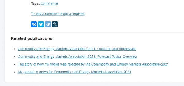
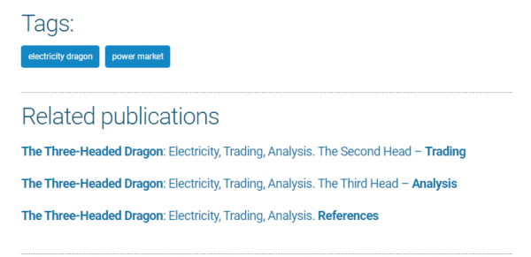
SEO: We set up similar publications, linking and tagging. All this was on the old site, but sometimes there were small errors like broken links or broken logic. We also updated the display of tags and similar publications.
Introduced the client to the basics of the E-A-T principle. Search engines have long been evaluating more than just text and technical factors when ranking websites. Criteria such as the quality of content and information, usefulness and the author's level of expertise are increasingly coming to the fore. E-A-T factors (an abbreviation for expertise, authoritativeness, trustworthiness) in SEO are criteria that Google's search algorithm considers when evaluating the quality of content and a resource as a whole. These indicators show that the page contains content that can be trusted, and thus the page is worthy of a higher ranking. The client now considers these factors when uploading content to the site.
Reputation, positioning
Newsletter subscription. We have added a newsletter subscription to the site. It is not too intrusive (once every six months), tells about new articles and helps the creator to find like-minded people.
Multilingualism. The English version of the website was underdeveloped. After talking to the founder, we found out that she wanted to put more emphasis on a foreign audience, to demonstrate a foreign experience. We took the foreign specifics into account in working with multilingualism, the site looks equally good in both languages.
Feedback form. Previously it was only in the Contact Us section, although it was sorely missed on the Collaboration page, where we added it too.
In the end, we did what we thought was a decent job of adding missing features, removing redundancies and freshening up the design.
At Initlab, we believe that along with the look and feel, you should pay attention to the usability, load speed and other indicators of the website. With a redesign, you can solve a lot of problems that you never get around to: improve the code, migrate to a newer version of Drupal, add new features, etc.
Add new comment