Increasing sales on a website helps to attract traffic and increase conversions. Ideally, it is necessary to work in both directions, but contextual advertising requires ongoing costs and may simply be pointless if the site is not good enough from the customer's point of view. Therefore, in the long term, it is much more effective to focus on increasing conversions, which will help you earn more money.
To develop a website, you need to constantly generate ideas to improve it: improve the design, tailor the usability to current user experience standards to increase conversion rates.
There is A/B testing to test hypotheses for improving web projects. It helps to know what customers think in practice and get specific statistics to draw the right conclusions and not to make too much of a mess.
In this article we'll explain how A/B testing works, what you can test with it, and why it's a particularly important tool for e-commerce projects.
What A/B testing is, what it is for and how it works
A/B testing is a tool to test hypotheses and improve website performance: conversions, depth of view, etc.
Sometimes obvious improvements are visible on the site: "bold" contacts in a prominent place will be called more often than the small number in the bottom corner, delivery information should be in a separate section rather than hidden at the end of the checkout, etc. So A/B-testing is conducted when everything that was on the surface has been improved and only unobvious hypotheses remain: if we move this block, will sales improve? What if we make the "Buy" button bigger and greener? Such hypotheses can be generated by the client-side marketer, the contractor's team or even the client itself.
For example: the marketer thinks that to improve sales the "In cart" button should be rounder and of a different color. To test this hypothesis, we need to make these changes to the page, collect statistics from site visitors, and see if this has the desired effect.
Of course, we can give the developers such a task immediately, but there are a number of problems:
- The assumption is based on the example of a more successful competitor's website, which means we are not sure it will produce a significant result;
- developers will spend working hours to upgrade the button, which will need to be paid for;
- If there is no effect after implementation, we will have to revert to the previous version, which means spending the development budget again.
In some cases, A/B testing helps to avoid waste. It allows you to track the dynamics and not to spoil the site with empty actions such as "put it back, put it back". But most importantly, it gives you a clear understanding of whether our hypothesis is correct and helps you almost certainly increase conversion rates and improve your site.
It is certainly possible to make changes on the fly, but it is better to do so with obviously bad parts of the site. Ideally, you should test the first to see if the users like it and if it has the expected effect.
We create two versions of the page - with and without changes. Half of the users go to one version, half go to the other. Based on their reaction (more or fewer clicks), we conclude whether the modified version brings the right results or it is better to leave everything as it is, at least until the next hypothesis.
That is, we don't just assume and run to implement, but experiment with visitor preferences.
A/B tests help to increase sales, find perfect headlines, make the website easier to use, etc.
To start working with A/B tests, it is necessary to understand what specific metrics are wanted to improve, i.e. have clear metrics: clicks on the payment button, number of orders, average check value, form completion, add to cart, depth of view, etc.
But how do you make changes to a website without changing anything on it?
There are special tools for A/B testing. We'll talk about one of them: Google Optimize.
Brief description and operation of Google Optimize
We won't give detailed instructions on how to use Google Optimize, but only on its features.

The principle of creating pages for an A/B test is quite simple: the url of the desired page is entered into a special line, which is opened in the internal editor - it can now be used:
- swap out the blocks;
- change the arrangement of the elements;
- change the colors of the elements;
- rename the buttons;
- add-delete block;
- change the headlines and more.
Even a beginner can make simple changes. For example, renaming a button does not require any special skills. But developers will be required for some hypotheses. For example, if we want to test a new button to which we need to connect functionality (add to cart, click a link, etc. )

There may also be poor-quality code on the website, which will distort the result of hypothesis testing. A poorly coded page will drive, break and look sloppy, which will surely affect the opinion of visitors.
The involvement of developers in this case also incurs costs, but.
- not as big as the "let's implement - oops, no, back to the way it was" case;
- fixing bad code is basically a necessary thing, so good developers will do it anyway, only here it may involve optimization work, immediately honed in on improvements.
Targets in Google Analytics
When we have made a 'dream page' with the right changes, we need to track users' reactions correctly.
In order for Google to understand what parameters we want to measure, we need to set a target in another service, Google Analytics. This works in conjunction with Google Optimize and is responsible for what parameters we will use to judge the success of our hypothesis.
Google Analytics is a service for analyzing user behavior on a website. Here you can track visitor behavior and important events (goals), count conversion rates, analyze the effect of advertising, etc.
A target in Google Analytics is any action by visitors to a website that is important to us: a purchase, a click on a button or link, a payment for a purchase, a subscription to a newsletter, etc.
If you didn't have Google Analytics goals set up before, e.g. for advertising campaigns, then Google Optimize has no baseline data, no "before" result to compare our "after" with.
However, don't worry: hypothesis testing is an excellent reason to start these very targets. Plus testing will partially overlap the problem, as half of the people will be on the old version and half on the new one, which means that the data will come in either way. It's just that the comparison won't be quite perfect, as a cross-section of the results over six months would show us a more complete picture.
We set up or select one or two goals from Google Analytics, i.e. we set the parameters that are important to us: visits to the desired page, session duration, number of pages per session, refusals. For e-commerce, we can measure more specific metrics (if they are our goal, of course): adding to cart, checkout, increase in average check, number of items in the order, etc.
Then we distribute the traffic. In classic A/B testing, visitors are split 50/50 - half see the old version of the page, and half see the new version. If the site's traffic is high, the ratio can be anything, even 10/90, the main thing is to understand if we get a complete picture with this distribution of traffic. It is important to have meaningful indicators on hand - 2 people a day will not give the right result, or will form a complete picture for a very long time.
To speed up the process, you can run contextual advertising on a landing page at any rate.
Case study: what hypotheses we have tested on our website
We've given you a little insight into how A/B testing works, and now we'll show you our example of what hypotheses we've tested and what we've come up with.
1. Team composition: experienced developers to the fore
Initially, the "Team" block on the "Site Support" page only featured the company's management team and managers - a fairly popular tactic, don't think we are vain.

Our hypothesis was to add our most experienced developers to the top of the list, indicate their professional experience and how many years they have been working with Drupal.

The tested version was more successful than the original: the session duration increased and the additional metric - refusals decreased.

2. We have changed the portfolio display: logos of major clients + relevant cases
Initially, the Portfolio page included the logos of all our clients, followed by a list of clients with a brief description of each project and the tasks solved. This helped potential clients find a similar case and see if we could cope with their tasks. In our experience, this was one of the main decision-making factors.
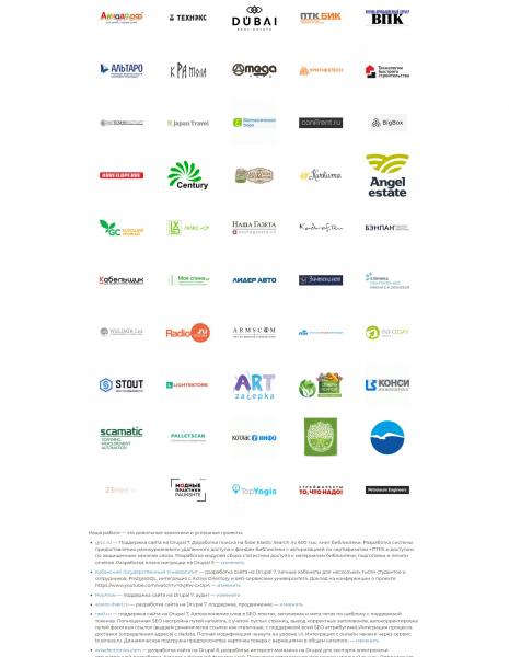
But after analyzing user behavior, we found that many customers don't click through to the job list, so we had two hypotheses:
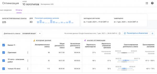
- place the logos of major clients + a list of projects below them;
- place only the logos of major clients to check whether the list of works actually helps customers in making a decision.
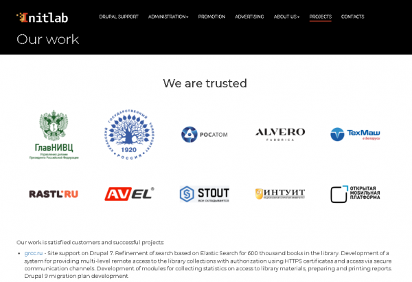
The original lost out because of the large number of our customers: people got bored of scrolling down the page and didn't get to the list of jobs.
A short pool of logos does not overlap the list and allows you to see the beginning of the list, which motivates a person to scroll further and see the rest of the cases. This option helped increase the length of the session on the client page.
3. block of text about Drupal: necessary or superfluous?
The Drupal developers ' involvement in the Drupal community life says a lot about them. We tested the hypothesis of demonstrating expertise by adding a block of text with information about our interactions with the Drupal community.
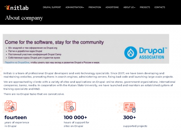
As it turned out, this hypothesis was wrong: the depth of browsing decreased and the number of bounces increased.

Brief information about the team and our strengths was enough.

A/B testing for e-commerce: improve sales on your website
As you have noticed, there are actually no sales and no clear conversions in our hypotheses, because in the case of complex services, nothing happens in a single click. We run a multi-stage process, where the main objective is to give as much information about ourselves as possible.
Online shops are more concrete - the result in a short period of time can be measured in money: payment clicks, shopping cart fill-ups, number of orders, average receipt value, etc.
Technically, in our case, it also counts for money, but in e-commerce projects, everything can be brought to automaticity, to specific orders. But in our business, any interaction can only be considered another step in the negotiation process.
A/B testing is a great tool for e-commerce. Instead of complex development, you can easily change most conversion points and look at the results. Here, the hardest and most important part of the job is the hypotheses. Ideally, they should be based on experience, knowledge or research, not taken "from space". We wrote above that hypotheses can be generated by the client, their marketer, the team working on the website, or all of them together. We believe that improving the website is a common task, so we are always ready to offer our experience and expertise in this matter.
What happens if you show similar products on the checkout page? What effect would a discounted bundle sale have? If you put unpopular categories higher up in the menu, will they sell better?
The main thing is to pick a hypothesis that will produce understandable results, and ideally increase conversion rates on the site.
An example of a hypothesis for our client
We helped formulate a hypothesis for one of the best online shops in Belarus, PNEVMOTEH. Let's give it as an example to show how non-obvious things can have an impact on conversion rates and require detailed analysis.
There are two tabs on the customer's website under the product box: "Consumables" (accessories) and "Kits" - the same product complete with what you need for it.
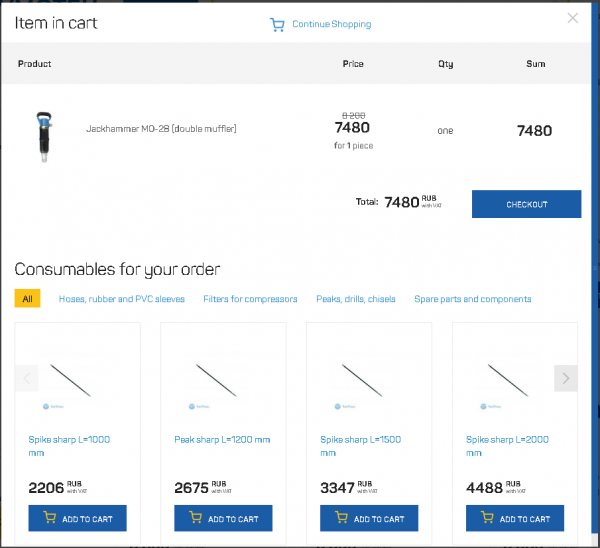
Our hypothesis: the active tab (i.e. the one that is initially open and comes first) is more visible, hence the product in it is more in demand and increases the amount of the check.
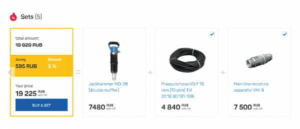
The active tab now, i.e. the first tab is "Consumables". To test the hypothesis, put "Sets" in its place.
This will help us understand what people need more and what will increase the average bill more effectively: active sales of components or kits.
To test the effectiveness of this hypothesis, we need metrics:
We'll add a "Buy Kit" target action to Google Analytics if it's not already there, then measure performance on that target + set an additional target - "Purchase Amount" - to see if the product bundled with consumables actually gets better buys and costs more.
After that, we will run the A/B testing, get the results and draw conclusions. This is a hypothetical A/B test.
Does your site need A/B testing?
We believe that there are no sites that don't need hypothesis testing at all. User experience standards, up-to-date design, quality of conversion points - there is always room for improvement.
You don't have to turn A/B testing into an assembly line and endlessly check how many millimeters to the right to make a miracle happen. You need to define your priorities, gather statistics on them and work to improve them. And no magic.
We do A/B testing as part of our website support. If you want to test hypotheses on your Drupal website, contact us.
Add new comment